Creative Asset & Video Workflow: One Board, One Link, One Yes
A self-initiated B2B concept for video production teams, designed to take a clip from first draft to client approval without a single comment getting lost in a Slack thread or a client having to create an account just to say what’s wrong with frame twelve.
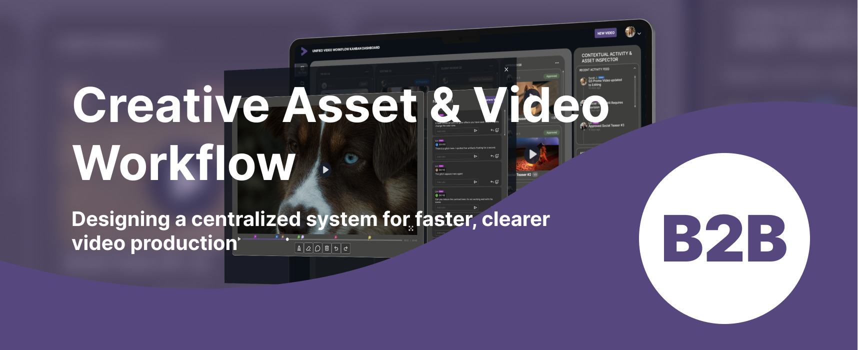
The idea. A unified video production workflow tool, connecting the strategist assigning work, the editor producing it, and the client approving it.
The maker. Built solo, grounded in a personal background in motion graphics and video editing.
The rule. Structured around three decisions, each one traced back to a direct complaint from the person it was built for, not a guess.
The reach. A concept, not a clickable prototype: two key screens and a motion graphics piece carry the story instead.
Where it started
Every video project runs through the same three tools at once: a Slack thread for questions, an email chain for approvals, a shared drive for the files themselves.
Somewhere in the middle of all of it, a client is trying to explain that the color looks off around the 12 second mark, with no way to point at the actual frame.
Having spent time on both sides of that handoff, producing motion graphics and video work, this felt less like a communication problem and more like a design problem: three roles, one asset, no shared source of truth.
The task
Design a centralized workflow platform for video production teams, under a few constraints set before opening Figma:
- No account, no login, no excuse for a client to skip the feedback. Reviewing and commenting on a video has to work from a single link.
- Every note gets pinned to an exact timestamp, not left as a vague paragraph that starts with “around the middle.”
- The status of any asset has to be visible at a glance, so nobody sends a message just to ask where something stands.
- One system, three roles: a strategist who assigns and tracks, an editor who produces and uploads, a client who reviews and approves, each seeing exactly what they need and nothing else.
The goal underneath the goal: cut the time a video spends waiting on approval, not just make the interface look nicer.
What I did
One shared loop, not three separate tools
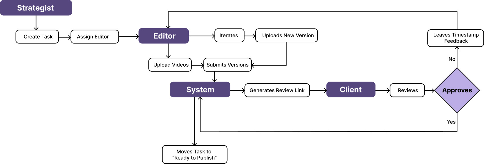
The core of the system is a single flow that ties all three roles together. A strategist creates a task and assigns an editor, the editor uploads a cut, and the moment a version is submitted, the system generates a review link on its own, nobody has to hand it off manually. A client works through that link, and the outcome branches exactly two ways: approve, and the task moves straight to Ready to Publish, or leave timestamped feedback, which routes back to the editor for another pass.
Nothing exits the system to get resolved. That loop is the actual product, the Kanban board and the review room are just two windows into different points along it.
A board that answers “where does this stand” before anyone has to ask
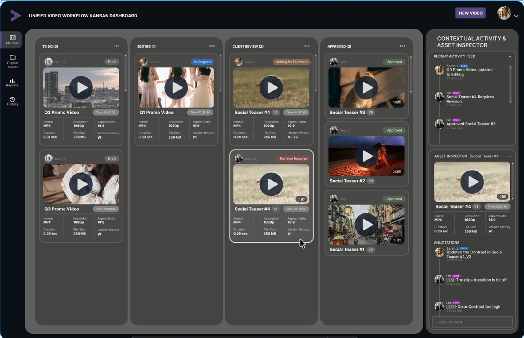
Every asset lives on a Kanban board: To Do, Editing, Client Review, Approved. Each card carries what a strategist actually needs without opening the file, a thumbnail, a status badge, the format and resolution, how long it’s been sitting there. Drag a card from Editing to Client Review and the status updates for everyone watching, no status update message required.
It’s a direct answer to the complaint that started the whole project: a content strategist who never wants to ask for an update again, because the board already has the answer.
Feedback that doesn’t make anyone hunt for files, or log in to leave it
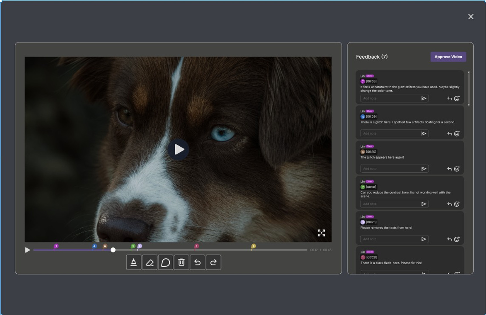
The review room drops a reviewer straight into the video with nothing to set up first, no account, no download, just a link and a player. Every comment gets pinned to the exact second it applies to, so “fix the color here” points at an actual frame instead of a guess. A client works through the open notes, and one clear action, Approve Video, closes the loop instead of leaving the answer buried in an email reply.
Two decisions live in this one screen: removing the login because an editor asked for feedback without having to hunt for files, and anchoring every comment to a timestamp because a client just wanted to click a link and say what to fix.
Showing the system in motion
This concept never got built out as a clickable prototype, so the clearest way to show how the three roles actually hand off to each other was to animate it: a strategist assigning a card, an editor uploading a cut, a client dropping a timestamped note, the board updating itself in response. The motion piece walks through that full loop in under a minute, which does more to explain the system than any single static screen could.
Where it landed
This is a concept project, not a shipped product. No client, no engineering team, no real usage data, just a system designed end to end around three quotes from the people it’s meant to serve. What it gave me was practice building a product where every major decision traces back to a specific complaint rather than a personal preference, and a chance to put a motion graphics background to use inside a product design process instead of alongside it.
What I’d change
This never got tested with a real strategist, editor, or client. It was designed from guerrilla interviews and direct experience, not validated usability sessions, and that’s the next step before I’d trust any of these three decisions completely. I’d also want to push past the individual card and comment interactions into the smaller states, hover, drag feedback, transition timing, and think through what this looks like for a team of twenty instead of three.