
AI HealthLink: One Question, Answered Fast
A self-initiated AI-guided triage app that gets someone from “something’s wrong” to the right kind of care, on whatever screen they happen to have open.
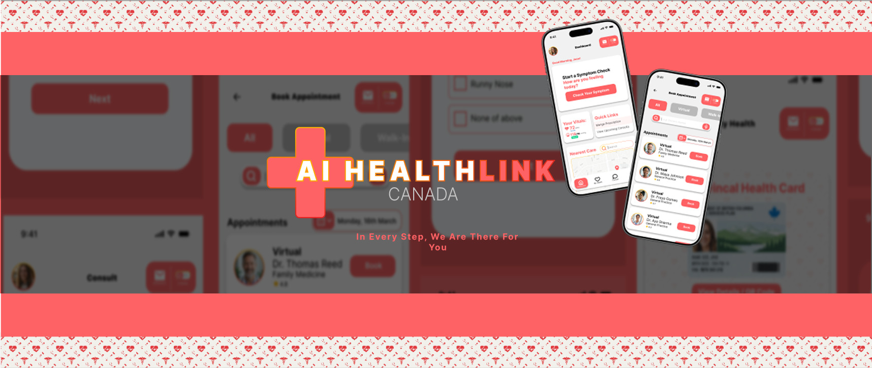
The idea. An AI-guided triage app that takes someone from an unclear symptom to a clear next step: call for help, book a consult, or see a nurse.
The maker. Built solo over four weeks, out of a personal frustration with figuring out where to go when something feels wrong.
The rule. Structured around one non-negotiable order: check for danger before anything else, then guide, then route.
The reach. Designed mobile-first, then studied for tablet and desktop to see what the same system looks like with more room.
Where it started
I moved to Canada without a family doctor, without a sense of how the healthcare system here actually works, and without knowing who to call the first time something felt wrong.
Looking something up meant piecing together wait times, walk-in clinic hours, and vague advice from forums, at exactly the moment I had the least patience for it.
That gap, the space between “something is wrong” and “here’s what to do about it,” felt like a design problem. Not a chatbot that guesses at a diagnosis, but a system that asks the right questions in the right order and gets someone to a real decision fast.
The task
Design an AI-guided triage experience for a mobile-first health app, under a few rules I set for myself before opening Figma:
- Safety comes before guidance. Nothing about symptoms gets asked until the app has ruled out an emergency.
- Triage has to feel like a conversation, not a form. Structured questions, one idea per screen, always visible progress.
- The result has to end in an action, not a diagnosis. A risk level paired with a next step: book a consult, escalate to a nurse, or call for help.
- The information architecture had to hold up if the same app ran on a tablet or a desktop, not just a phone.
Four weeks, no client, no handoff, just the discipline of finishing what I started.
Finding the flow before touching a component
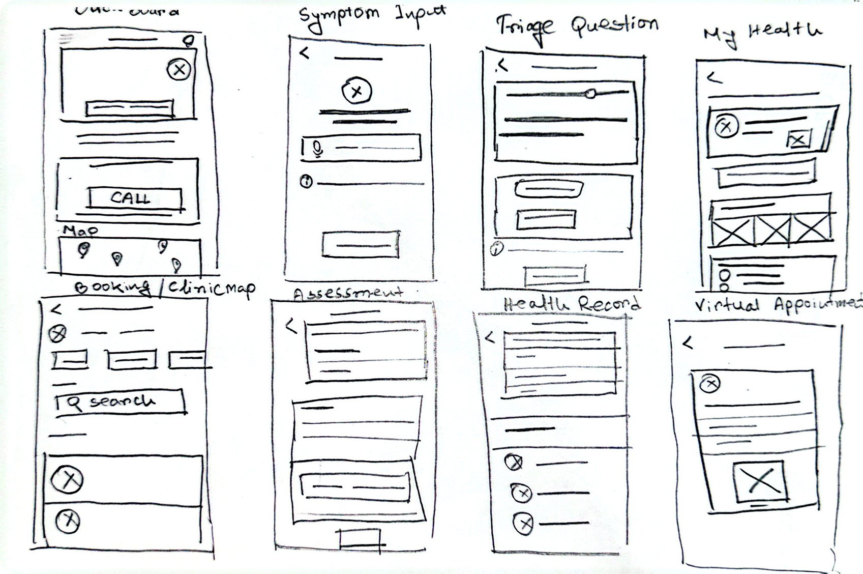
Before any of this had a color system or a single real component, I worked it out by hand. The safety gate, the booking split, the health record view, all sketched as rough boxes and arrows so I could see whether a sequence actually held together before spending an hour building it in Figma. It’s a lot cheaper to catch a broken flow with a pencil than three screens deep into high fidelity.
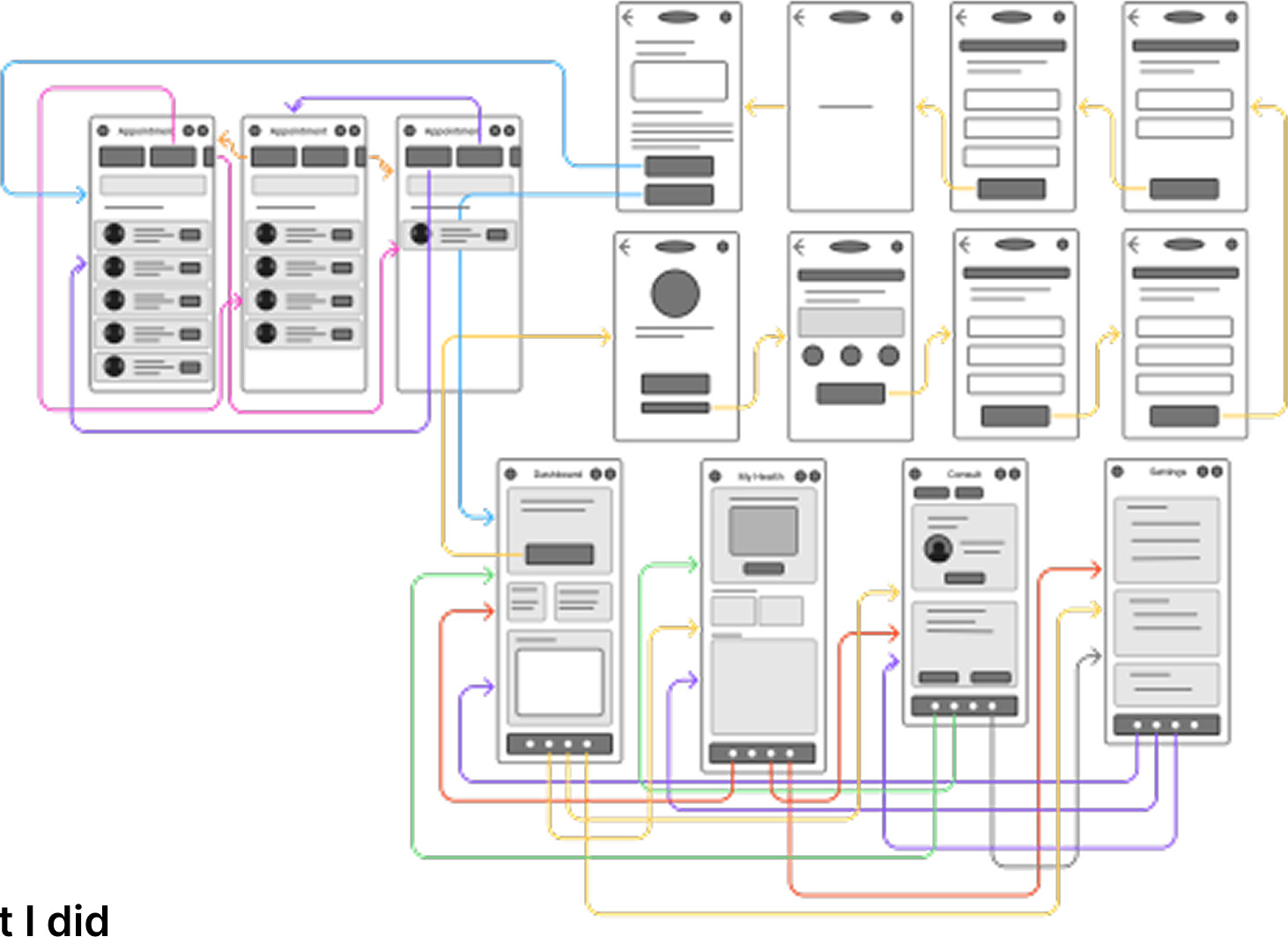
Once a sequence survived that first pass, it moved into low-fidelity wireframes: same structure, no color, no type, just labeled boxes and connecting arrows. That let me test the shape of the whole system end to end, where the safety gate hands off to triage, where triage hands off to booking, before a single screen was designed to look like anything.
What I did
A safety gate before a single symptom question
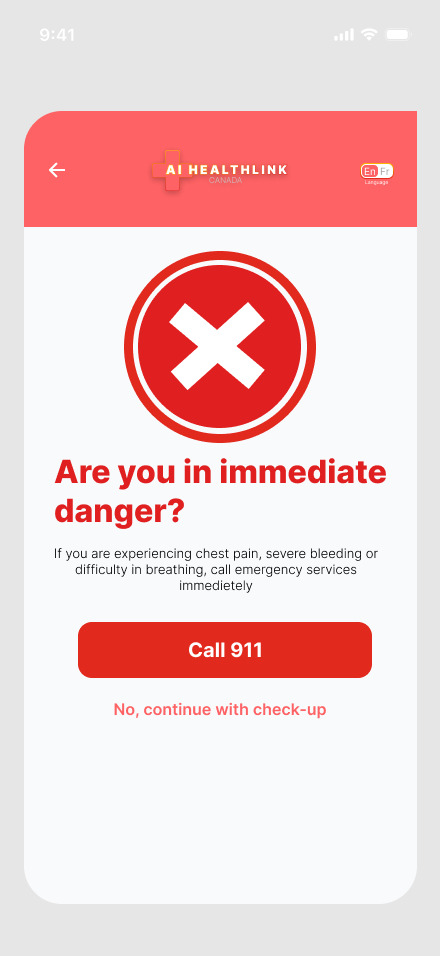
Most symptom checkers ask “what’s wrong” first and hope the user knows to call 911 on their own. I flipped that. Before AI HealthLink asks a single question about symptoms, it asks one thing: are you in immediate danger. A dead simple screen, a single red action, no branching.
Only after that gate clears does the app move into triage. It sounds like a small sequencing decision. It isn’t, it’s the one screen that makes the rest of the flow safe to build on.
Triage as a conversation, not a form
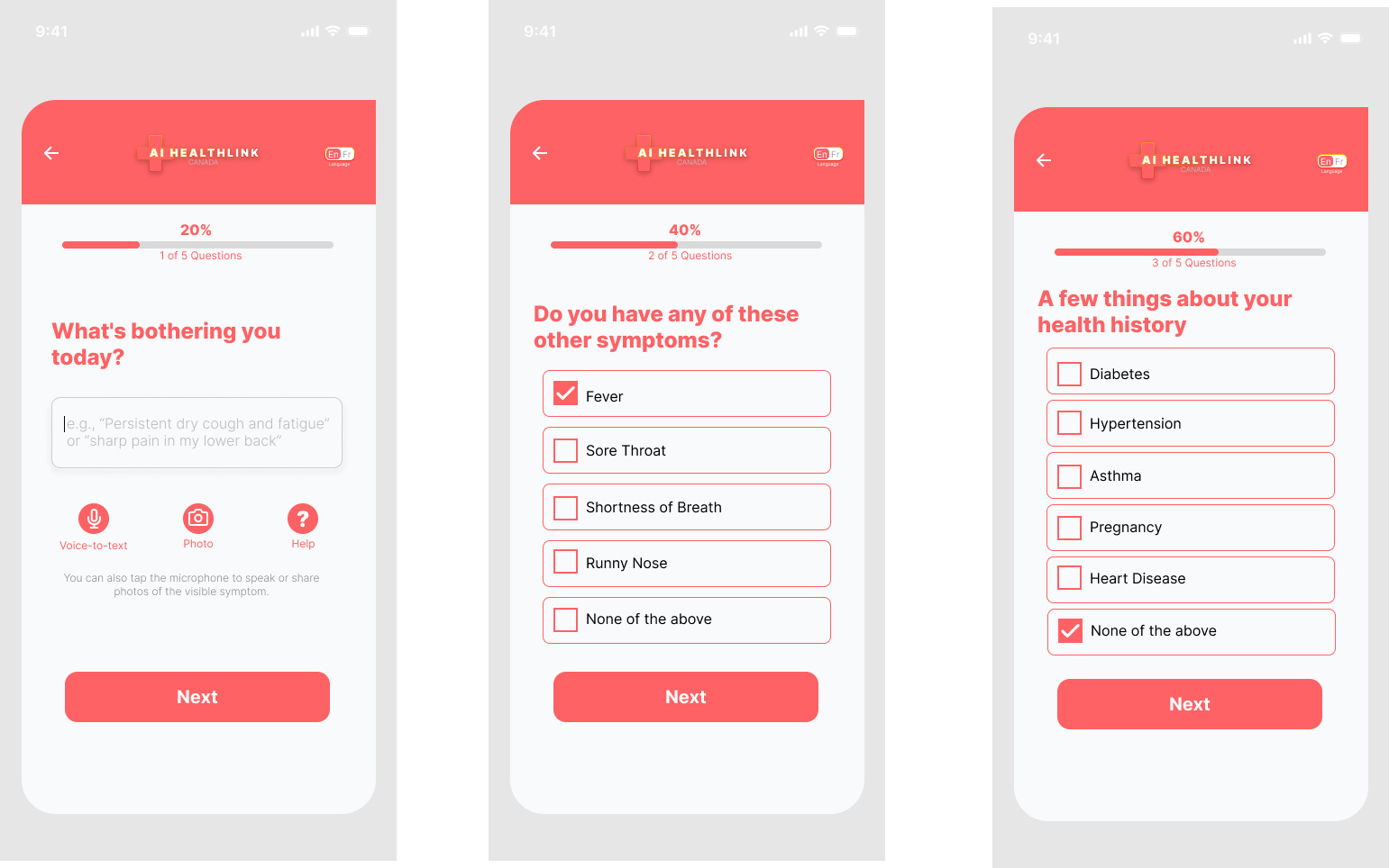
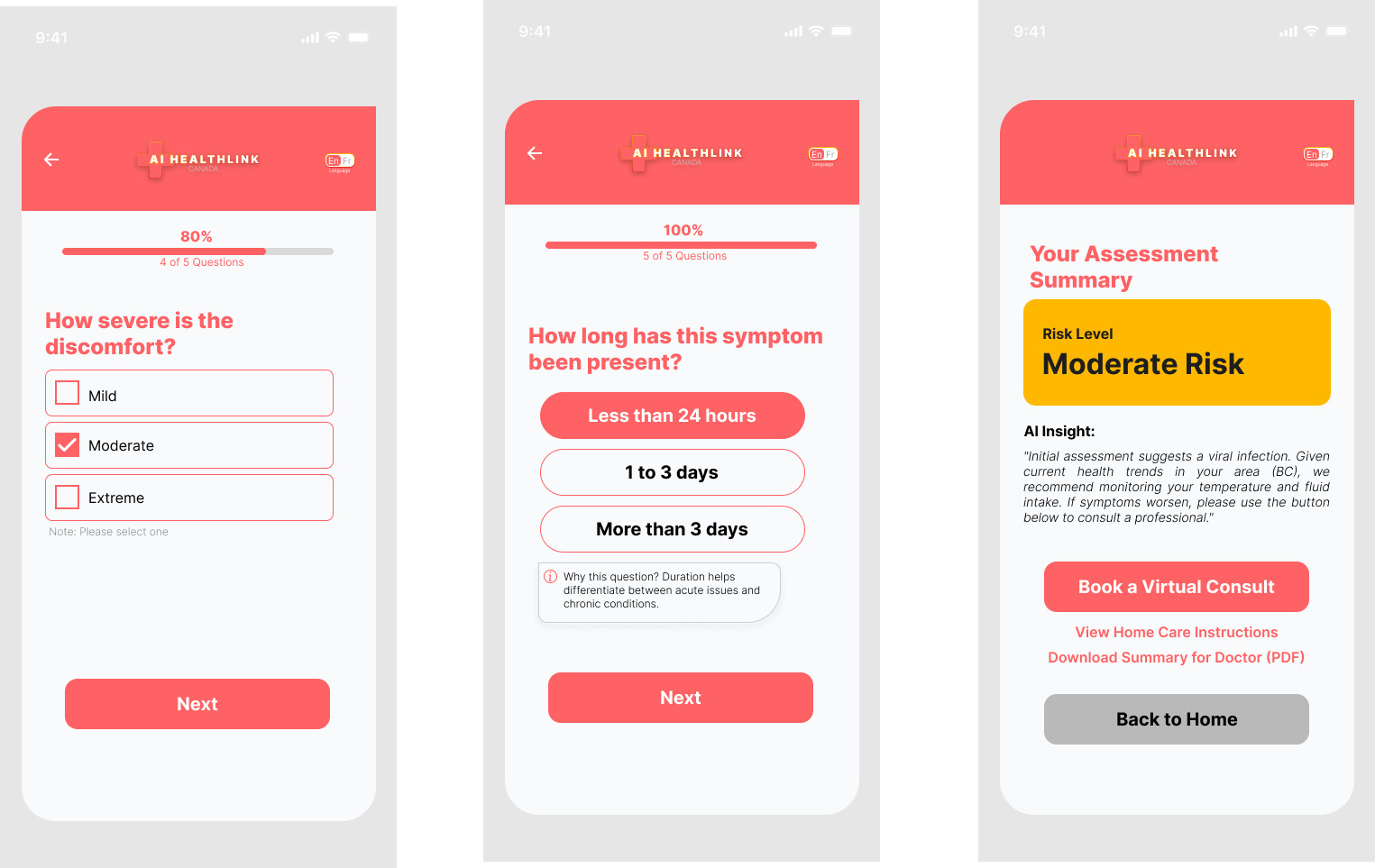
Once the danger check clears, the flow asks what’s bothering the person today, then narrows: related symptoms, relevant health history, severity, how long it’s been going on. Each screen holds one decision, with a visible progress bar so the person always knows how much is left.
The flow ends on a risk tier, not a guess at a diagnosis: a plain-language result like “Moderate Risk,” paired with an immediate next step, book a virtual consult, or switch straight to a nurse. The app never tells someone what’s wrong with them. It tells them what to do next.
One dashboard, four doors in
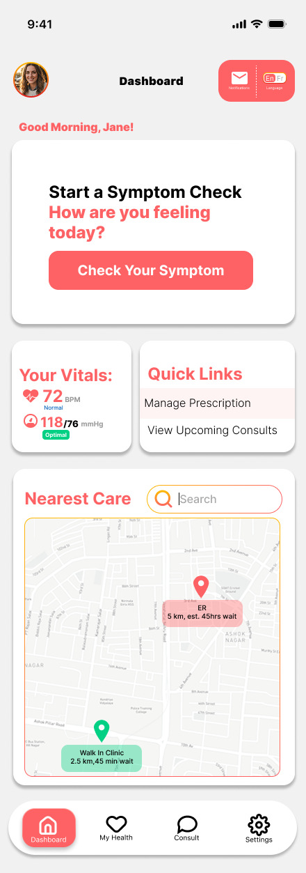
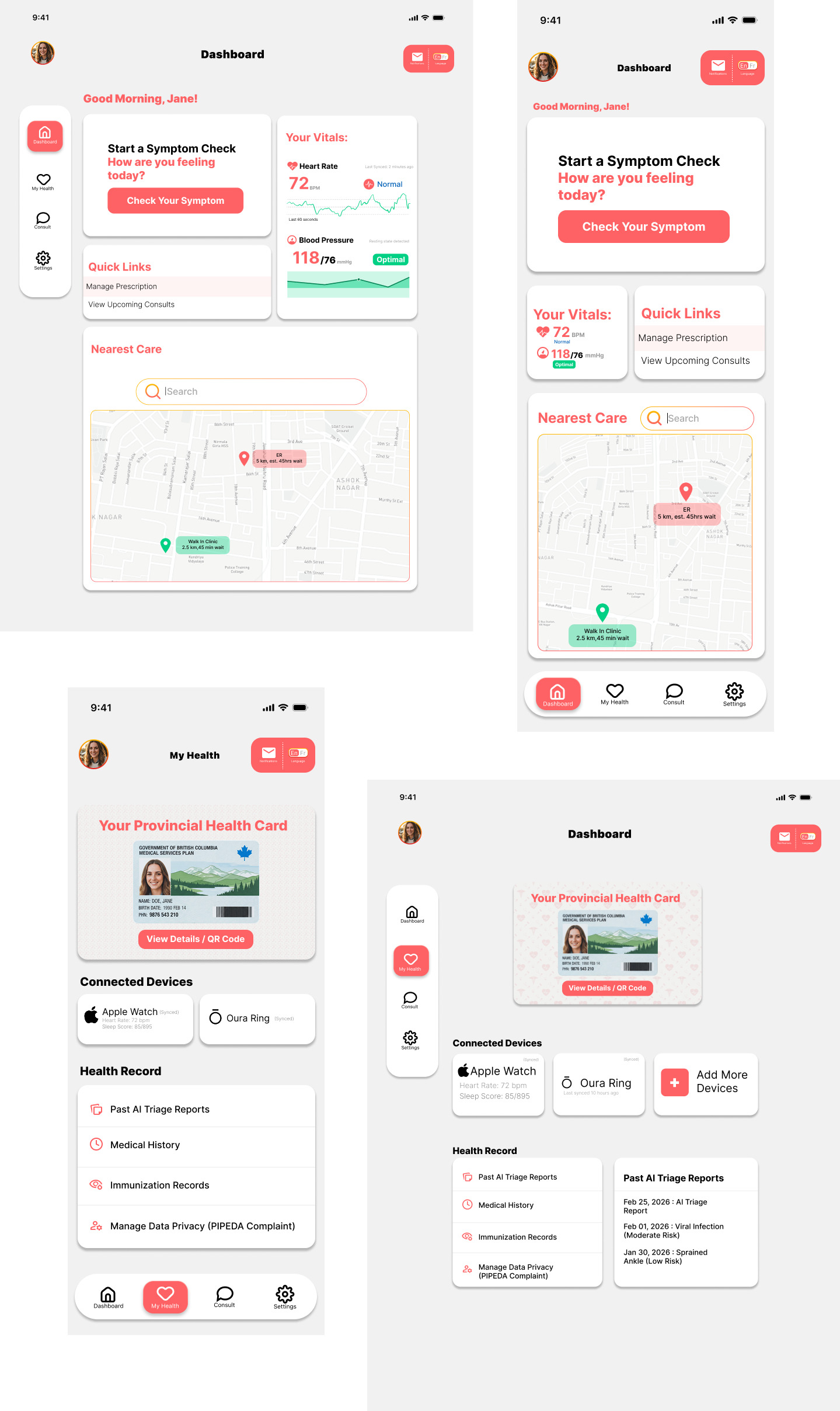
Everything else in the app hangs off a single home dashboard: start a symptom check, check your vitals, jump into quick links, or search nearby care on a live map. My Health holds the provincial health card, connected wearables, and a running health record. Consults and Settings round out the shell.
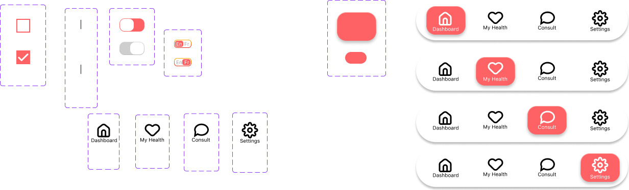
Four sections, one shared component system underneath, one bottom nav to move between them.
Booking care without leaving the flow
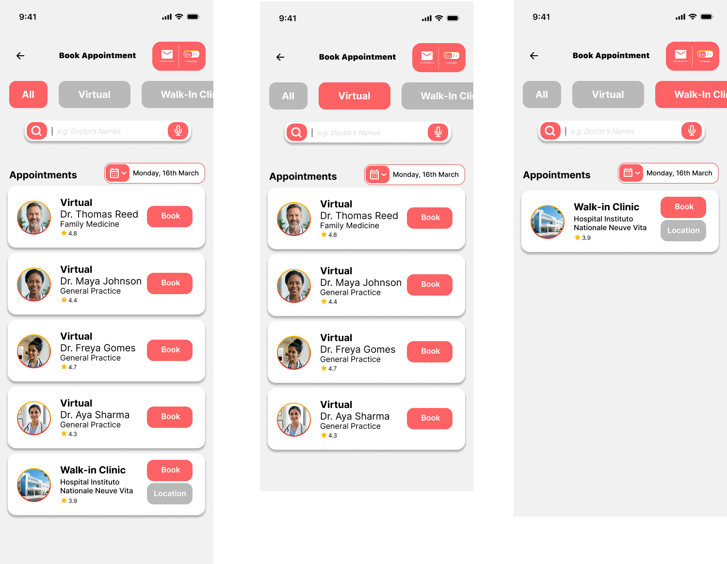
The result screen from triage isn’t a dead end, it drops straight into booking. Appointments split into virtual and walk-in, each showing real provider photos, specialties, and clinic locations, so the decision the triage flow just made turns into an actual appointment in the same session.
Designing past the phone
AI HealthLink started mobile-first, but I wanted to know if the same information architecture would survive more screen space, so I ran a short adaptation study on two screens: the home dashboard and the health vault.
The bottom nav becomes a persistent sidebar. The nearest care map, a small snippet on mobile, expands into a full interactive view with real-time wait times instead of a separate tap. Health records shift from a scrolling list to a master-detail layout, a list on the left, full detail on the right, so nothing needs its own screen anymore. Nothing about the underlying system changed, only how much of it could be shown at once.
Only the home dashboard and health vault exist as tablet screens. The rest of this section is written from a planning brief, not from finished UI, worth a look before this ships in the real case study.
Systems underneath
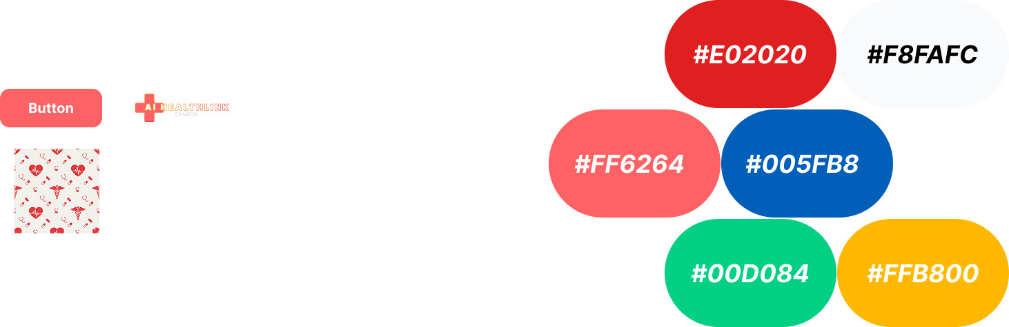
One color system, one component library, one bottom nav pattern used consistently across every section. Buttons, toggles, checklists, and the four-state nav bar all resolve to the same set of tokens, which is what made the tablet study possible without redesigning from scratch.
Try it
This is a live, clickable version of the flow above, not just static screens. Start from the safety gate, answer the guided questions the way a real user would, and see how a risk tier turns into an actual next step: book a virtual consult or route straight to a nurse.
It covers the core path end to end, from “something’s wrong” to an appointment on the calendar. A few screens outside that path (Settings, some My Health states) are there for context but aren’t fully wired up yet.
Where it landed
This one didn’t ship. There’s no client, no team, no production handoff, just a system I designed end to end because I needed it to exist. What it gave me was a real answer to a question I’d been asking myself since landing in Canada, and a case study built entirely on my own judgment, with no one to defer to when a decision got hard.
It also set a pattern I’d lean on again later: route by capacity instead of designing one flow for an average user who doesn’t exist. AI HealthLink routes by risk tier. The next project I built on that same instinct routed patient intake by how much someone could actually handle in the moment.
What I’d change
The practitioner side never got built, only the patient app exists, and a real triage product needs a matching view for whoever is on the other end of that risk tier. I’d also formalize the tablet study into a full second platform rather than two adapted screens, and tighten the case study deck itself, there are a few duplicate drafts in the file that never got cleaned up.