
HelpAfterAccident: One Shared System, Five Diverging Flows
Onboarding and intake for a marketplace where doctors, lawyers, and accident patients all sign up through the same product.
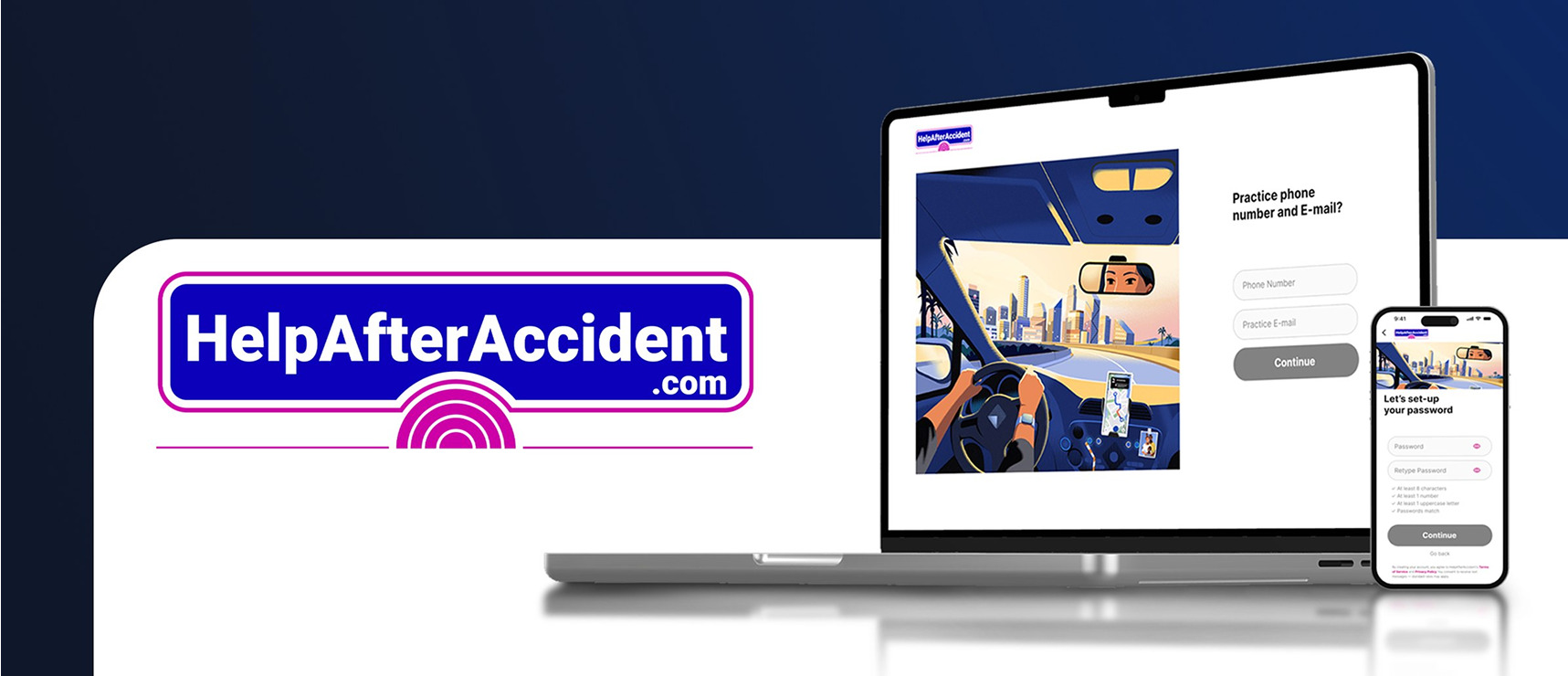
A two-sided marketplace where professionals abandon long signups and patients arrive minutes after a car accident.
Onboarding and intake for five user types on one shared component system, mobile and desktop, in ten weeks.
Split the profile into single-purpose screens, rebuilt clinic hours around the common case, and replaced one intake flow with four routed by patient capacity.
Approved for the production build: 5 personas, 2 platforms, 100+ screens, 0 forks of the design system.
Where it started
HelpAfterAccident matches people injured in accidents with verified doctors and lawyers nearby, and gives those professionals a steady stream of matched leads.
It’s a two-sided marketplace, so supply and demand fail differently. On the professional side, a doctor abandoning signup at step six isn’t a lost user, it’s a hole in supply that patients feel weeks later. On the patient side, people arrive rattled, in pain, sometimes on a borrowed phone.
Neither side could be served by a generic form, and neither could be served by a separate product. Five user types (doctor, lawyer, patient, marketing partner, influencer) all had to sign up through one system.
The task
Design the full onboarding and intake experience for all five personas across iOS and desktop web, under three constraints my senior designer set at kickoff:
- The trunk stays shared. Same auth pattern, same components, same visual language, so engineering builds once and branches. No forking the design system per persona.
- A complete practice profile has to feel short. Credentials, practice details, clinic hours, team, payment preferences: roughly ten pieces of information that couldn’t be cut, only reshaped.
- Patient intake has to flex. It had to work for someone filling out a form calmly and for someone who can barely hold a phone.
Ten weeks, four critique checkpoints, every round presented and defended.
What I did
Each decision below follows the same shape: the problem, the move, what it bought.
One question per screen
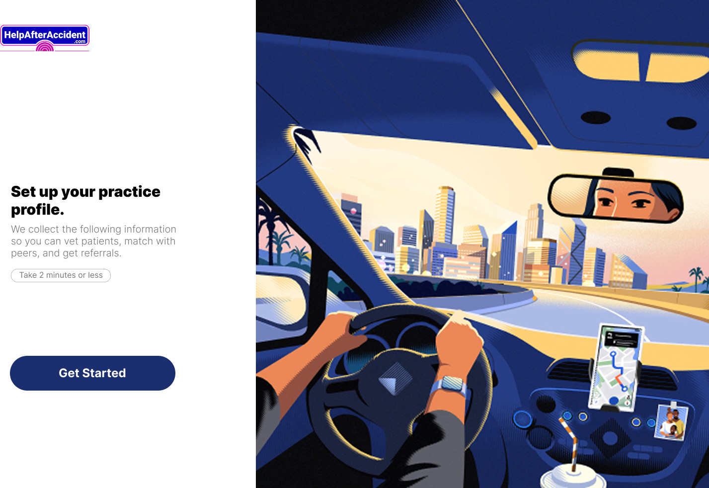
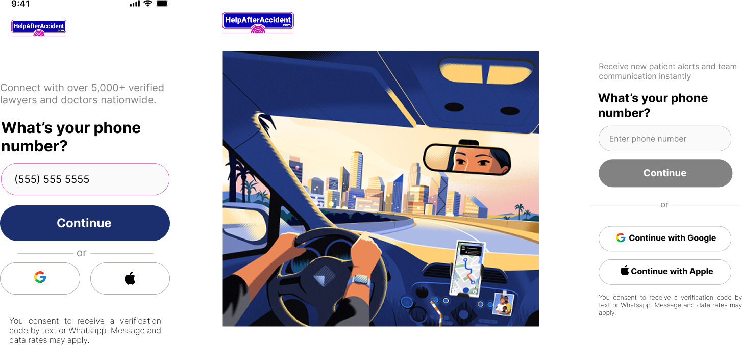
Ten questions on three dense forms tests a professional’s patience on the first screen. I split the profile into single-purpose screens, each with one call to action: What’s your name? Where is your practice? Set your clinic hours. A “two minutes or less” promise sets the contract up front, and headlines talk back: once Jane selects Doctor, the next screen greets her as Dr. Jane.
The trade is more screens for lower per-screen cost. Every step ships in empty, filled, and disabled/enabled states.
Clinic hours, rebuilt around the common case
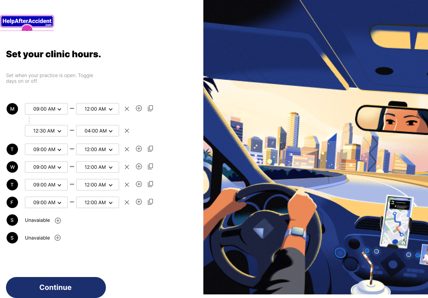
My first clinic-hours screen used a dropdown row per day. It worked, and it was cramped and fiddly on a phone. In critique my senior asked one question: how many clinics actually keep different hours every day?
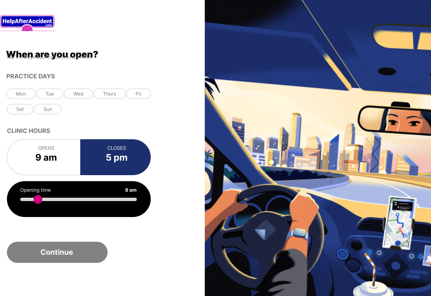
Almost none. The revised pattern uses tappable day chips with Mon to Fri pre-selected and a single opens/closes control. The common case collapsed to two taps. The irregular schedule still works, it just stopped setting the default.
Four intake models, routed by capacity
Designing one patient intake flow means designing for an average patient who doesn’t exist. So I designed four and let the platform route between them: one-click intake, where the platform pre-fills and the patient confirms; self intake, the full form, for patients who can handle it; digital intake with guided instructions, one step at a time; and phone intake, run by a specialist, where the patient’s only job is to pick up.
This turned intake from a screen problem into a routing capability the business didn’t have before.
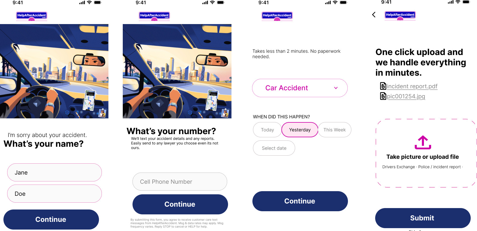
Digital intake
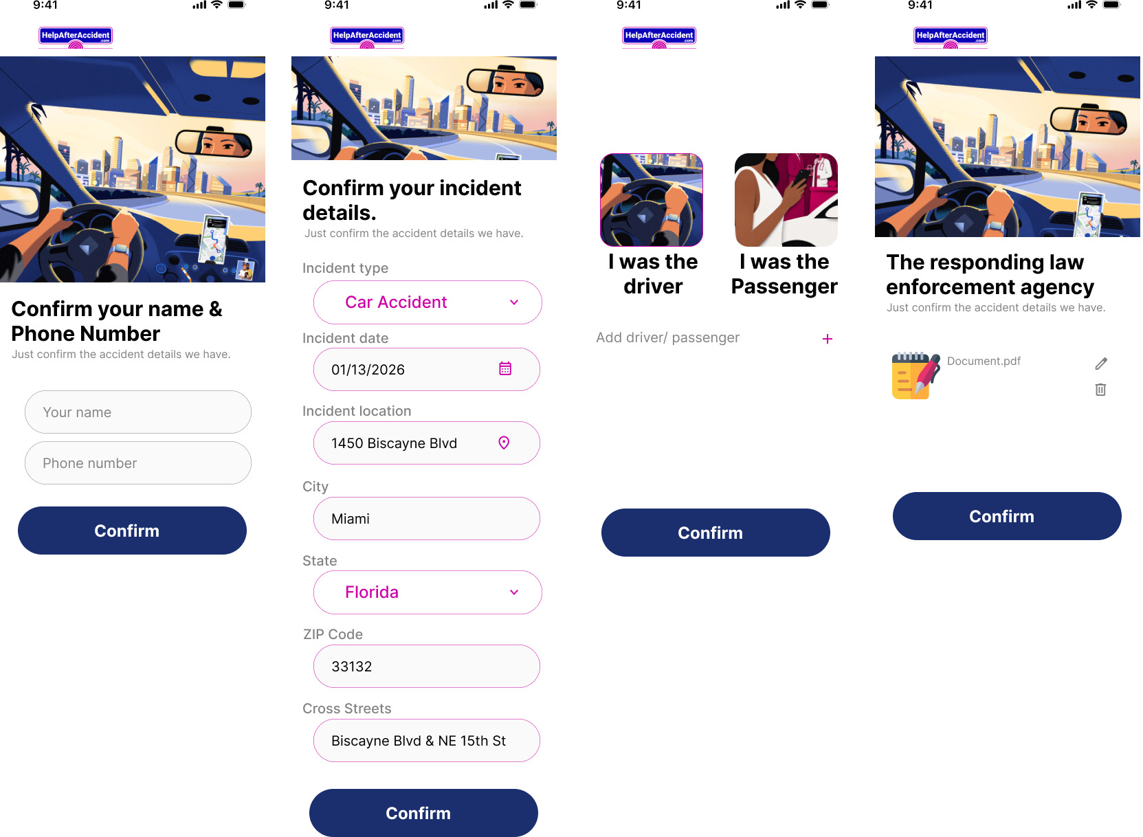
Phone intake
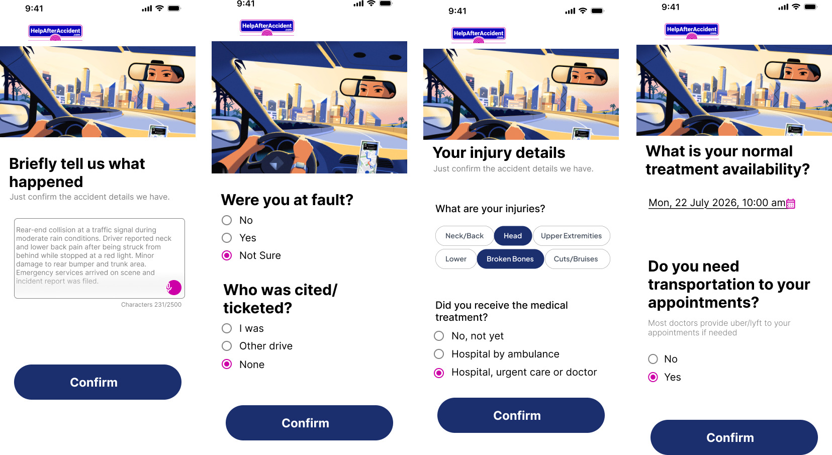
Trust signals at the three skepticism spikes
Skepticism peaks in predictable places, and each gets an answer. The first screen leads with the platform’s own network size claim, 5,000+ verified professionals nationwide, used here as a trust-signal design input rather than a personal result. Password creation uses rules that check off live as you type. Before going live, a review-and-finish summary makes every section editable.
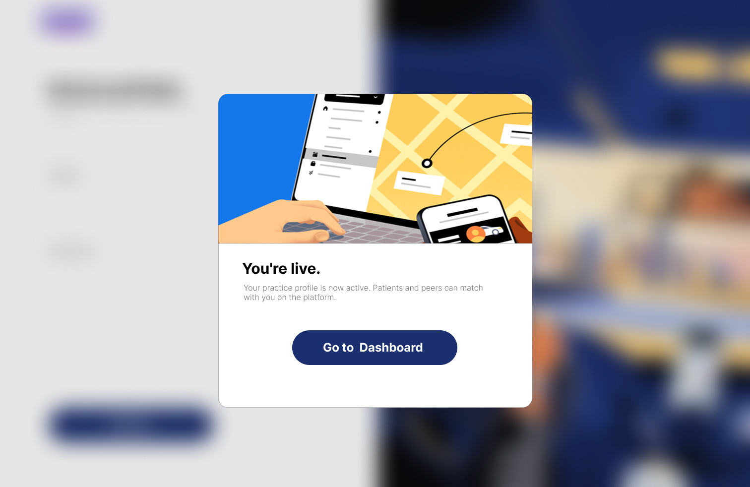
The last screen reads: “You’re live. Patients and clients in your area can now find you.” Signup ends on a payoff rather than a dead end.
Professionals often sign up from a front-desk computer, so every mobile step has a desktop counterpart: brand illustration on the left, focused form column on the right.
Systems underneath
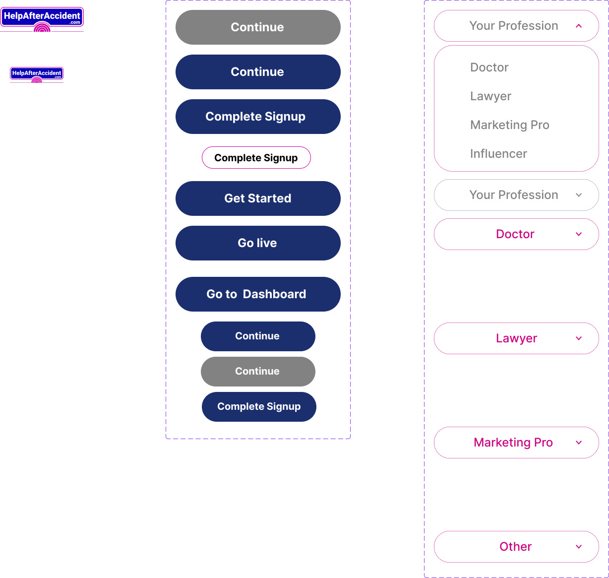
Every element resolves to one shared library: profession selector, incident type control, button variants, binary toggles, one token set. That’s what made five distinct roles possible without duplicating screens.
Try it
Walk the patient flow end to end: profession selection, incident type, appointment context, confirmation.
Where it landed
Approved for the production build. My senior designer and the GoMAXPAIN team signed off, and the flows went into development during the contract.
- 5 personas onboarded through one trunk, 0 forks of the design system
- 100+ screens across mobile and desktop, each in empty, filled, and disabled states
- 4 intake models shipped as a routing capability, not a single flow
- Set the onboarding visual language that later persona flows adopted
Onboarding was designed to complete in under two minutes, validated in prototype walkthroughs. The metric I’d have instrumented first is step-level drop-off across the practice-details sequence, since that’s where the ten unavoidable questions live.
“They don’t just place pretty buttons, they analyze the structural dependencies of a workflow.” From my performance evaluation · Senior Product Designer, GoMAXPAIN
What I’d change
Formalize Figma variables and component sets before screen production rather than maintaining shared element sheets, and define contrast ratios and touch-target minimums at the component level on day one. Both are cheap before components are built and expensive after. I’d also add a stepper to the one-question-per-screen pattern, it’s the first thing I’d test.